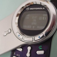
I first saw the Motorola V70 in an ad in the newspaper. News about the phone was buzzing because this was Motorola’s first break from the old flip design that they’ve become known for. In fact, the V70 is visually stunning and does a good job of breaking away from the traditional “Startac” flip-like concept that is the trademark of Motorola.
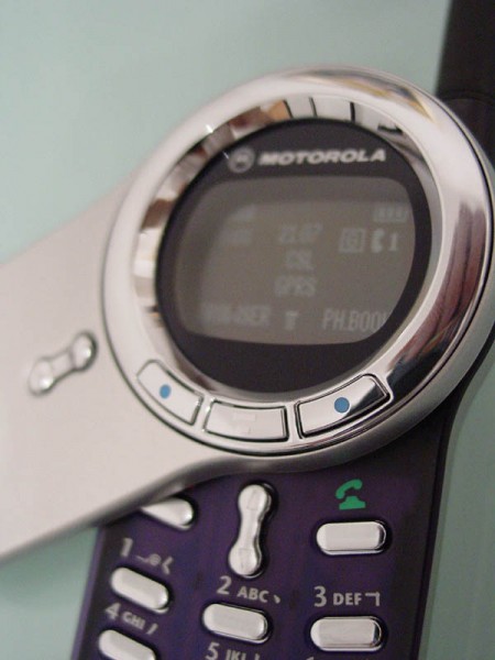
Motorola V70 Mobile Phone
Unfortunately, before I quickly get into the review, I should point out this phone is a dual-band GSM900/1800, which means that it will not work in the US. Sorry. On the flip side, the US has never been a strong market for handset upgrading so its no surprise that Motorola has not put in a lot of effort to get it into the US. No surprise either that Motorola announced that Hong Kong was the first place in the world that would get the V70. In Hong Kong, the mobile phone is more than just a phone, it’s a fashion accessory/gadget item. As such, we upgrade phones like crazy (we have to have the newest one) and I am probably the leader of that pack (I can’t even remember now how many phones I’ve had). I am obsessed. But then again, I’m working (indirectly) with the telecommunication sector so I feel that I have to “know” and try all the different products. Well, at least that’s what I tell myself.
When I first read about the V70, I was already beginning to have sort of weird problems with the T68. While I had no major problems with the T68, and in fact, I really like the phone, there were complaints from people that I spoke with on the T68 that they couldn’t hear me. Actually, they said they could hear me too well — that the background noise was drowning out my own voice. The problem with the T68 is that the microphone is “oversensitive” or at least that’s what my mobile phone provider told me when I bought the V70. He also told me that Ericsson knows about this problem and that they would fix the microphone for me if I brought the phone in. So far, I haven’t had to time to check this out and actually go do it. Instead of dealing with it, I bought a new phone (though I’ll probably go get it checked out later).
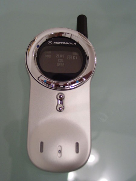
Motorola V70 Mobile Phone full
Form
Here’s where the V70 is the real winner. What a stunning phone! The all metallic casing is absolutely fantastic. I can’t praise enough how good this phone looks. The surface of the phone reminds me a lot of the solid feel of the Nokia 8850/8890. Despite this solid exterior, it’s surprisingly small and light, which means that the Motorola boys have been working overtime on the design. Unfortunately, Motorola still hasn’t figured out a way to incorporate their antennae into the phone so it’s the one minus point. Although it doesn’t bother me as much, it’s still a bad design compared with the Nokia and Ericsson because the antennae gets snagged quite easily in your pocket.
The screen is a very interesting change as well. It’s a reverse backlight where it’s white on black instead of the more traditional black on white. That makes the screen look amazingly cool, but in bright daylight, it can be difficult to see. I definitely will not be giving this phone to my parents to use – they won’t be able to see a thing.
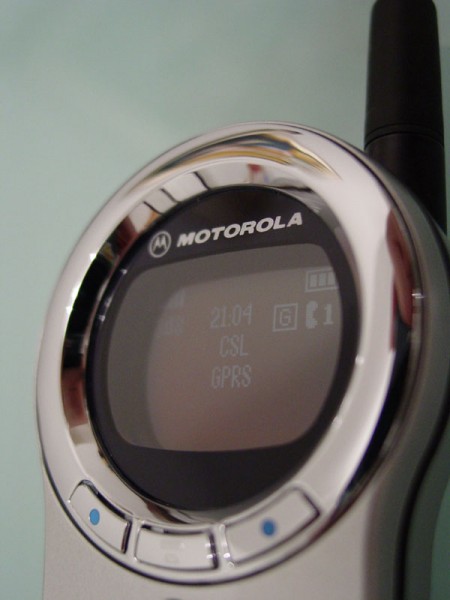
Motorola V70 Mobile Phone closeup
Lastly, the one major feature that makes the Motorola V70 so unique – the swivel flip cover. Yes, it goes all the way around, and at first it’s a bit silly. But, after you use it for awhile, it’s actually pretty cool. It’s like the first time you used the Startac or Nokia’s slide design. It takes a little while to get used to it, but after a few hours, you can pretty much flip the lid 180 degrees with just one hand.
I really also like the “electro-luminescent colored soft touch keypad”, translated, that’s the blue cover on touchpad. It’s a nice shade and glows really nicely when it’s in the dark.
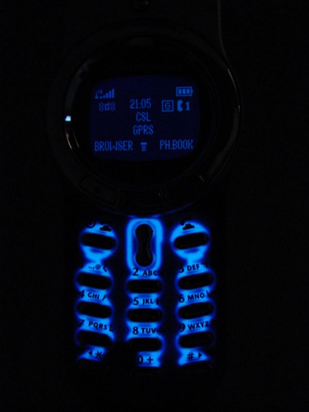
Motorola V70 Mobile Phone Lights
All in all, this is a really great looking design and I like it more and more the longer I use it.
Function
So how does this mobile phone work? Well, as far as basic phone functions (making and receiving calls) this phone works great. Reception is clear (both from the listener and the speaker standpoint). I have no problems with this as a phone.
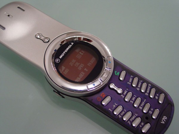
Motorola V70 Mobile Phone open
But that’s about the end of the joy with Motorola. Millions of dollars spent on R&D, many years later, and Motorola still can’t come up with a decent menu and functions. What’s going on? You would have thought that somehow, Motorola would be more than capable of making a phone that actually has a decent menu. Ericsson (as mentioned in my T68 review) has come a long way and works very much like the Nokia. Motorola though seems to have given up. Their functions are cumbersome, slow, and sometimes downright pathetic.
Take for instance one very simple task that I like. Because streets are sometimes crowded and it’s difficult to hear, I like it that the Ericsson and Nokia phones vibrate AND ring at the same time. Motorola, for as long as I can remember, can only do one or the other. It can ring, vibrate, or vibrate and then ring, but it can never do both at the same time. I mean, come on, how hard is this to do?
Nokia made me a big fan with their “profiles” because I can easily go from ringing (outside) to silent mode (in the office) with the push of two buttons. With the Motorola, you have to open, click (twice), scroll down, click again, then scroll down, then select and finally close the phone. Yeah, that’s user friendly!?
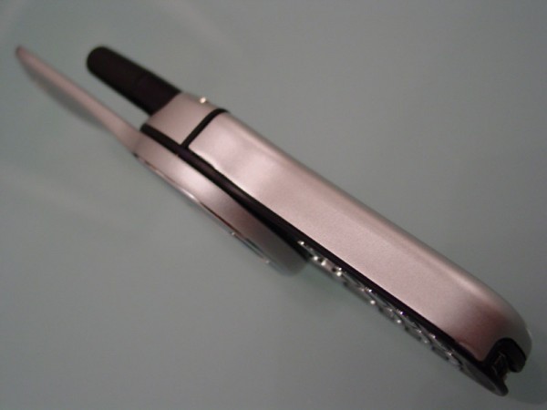
Motorola V70 Mobile Phone Side
Adding to the pain, the response time on the Motorola has to be the slowest I have ever seen on a mobile phone in the past 5 years. It’s really irritating. When you initially turn on the phone, the first time you go to access your phone book, it takes a whopping 22 secs to load up. What a disgrace! Push the cancel or back button, and there’s always a two second delay. This is particularly annoying when you make a mistake, push the button, think you didn’t push hard enough, so you push it again, and of course, it deletes two characters. The same problem exists in the menus, when you push back, it takes 2-3 secs for the menus to respond. Just pitiful. This is like running Windows XP on a x286 PC!
GPRS functions work fine. Except, when you’re used to the large color screen, it’s just so hard to go back to this really tiny screen. The games on the V70 are pretty new, but again, its tough to see in daylight. Blackjack though is pretty fun. Battery life is really good, particularly because there is no color screen to drain batteries.
Because of the cumbersome menus and the overall pitiful applications, entering phone numbers into the V70 has become a difficult task. It’s easy enough to add a number, but the V70 automatically stores the number to the phone memory instead of the SIM card. When you transfer the number to the SIM card, you lose all the formatted information like the “type” of phone number (home vs office, etc.). All in all, it’s just annoying that we have to take these extra steps just to do simple things on this phone. I could probably go on and on about the menus but I think you get my point, it’s not user friendly.
Factor
Ok, enough about the disastrous menu and functions. Anyway, the V70 is a fashion accessory, pure and simple. It is fantastic to look at but the inside has little to be desired. So if you’ve got MONEY TO BURN, then go ahead, get one, it looks great. But, if this is going to be your next phone that you keep for sometime, then you’ll probably end up being more frustrated than pleased, especially if you’re used to a Nokia phone and all of its functions. You also have to bear in mind that the going price for the V70 now is 60% MORE than a brand new Ericsson T68 and twice the cost of the Nokia 8310 (costs nearly US$700). If you really have to have this phone, then wait a month or so for the price to fall.
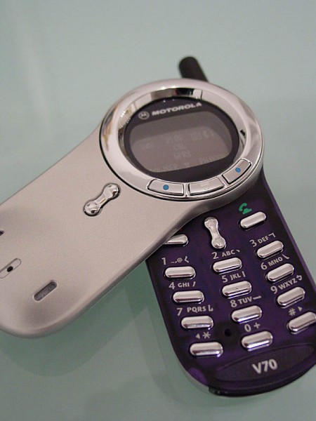
Motorola V70 Mobile Phone partial open
